
Barker Brooks

Project details
CLIENT: Barker Brooks Media
BRIEF: Brand identity for Harrogate-based publishing house
Project Notes
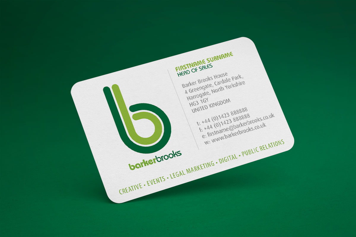
Developed to coincide with the expansion of BBM and relocation of the business to new premises. A move away from the previous staid, traditional serif-face logo in orange to something more reflective of the company’s foray into digital publishing and web development, with echoes of contemporary game design graphics and a nod to the two personalities behind the founding of the company in the twin, parallel forms in the logo.
Are you looking for something similar for your business? Get in touch and let’s talk it through.